Making order processing efficient to increase customer satisfaction & retention

My role
Doing user research by visiting stores, delivering end to end designs, making prototypes for usability tests, performing usability tests.
Team
2 designers, 2 product managers, Ops. team, Engineering team
Timeline
Jul 2021 - Nov 2021
Dunzo
One of the largest 24X7 delivery platforms in India, that picks and delivers anything and everything within the city.
Dunzo Daily
Org’s primary focus, Dunzo Daily is a quick e-commerce service which full-fills your daily needs through its micro-warehouses & local merchants.
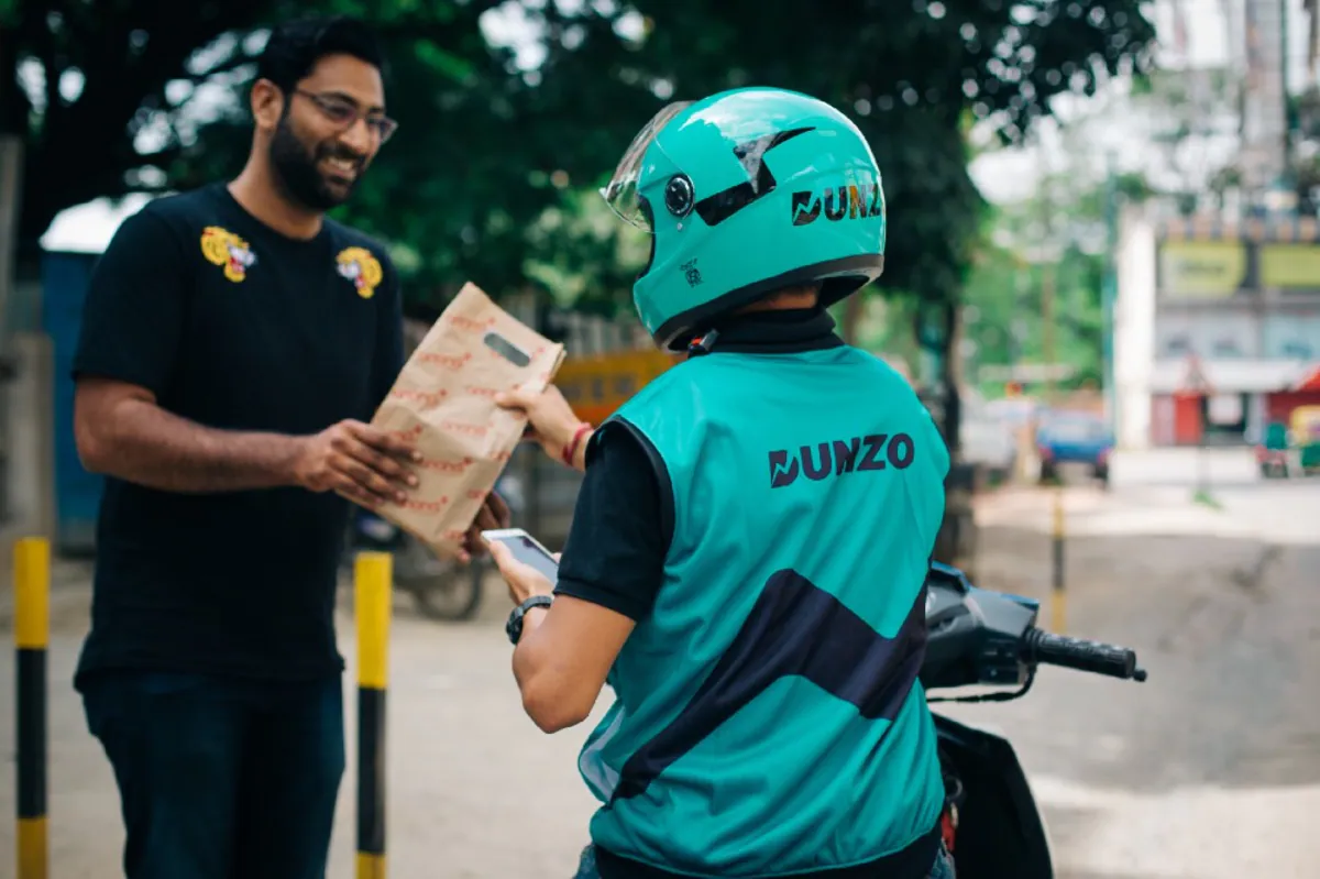
How does Dunzo Daily work?

Customer places an order
Nearest merchant receives and prepares the order
Delivery partner picks up and deliver the order
How does order processing work at the store?

Picker finds and scans all the ordered items from the racks
Packer packs all the items in a bag
Handover person handover the order to the delivery partner
Problems identified
When we launched Dunzo Daily MVP in Bangalore, we started to notice a pattern of the complaints from our customers. And because of that we were not able to retain those customers.
🤨
Defects in delivered items
Quality of some items was not up to the mark. Other defects were related to expiry date, wrong variant (e.g. ordered 100 Gm, received 50 Gm), wrong brand etc.
⏳
Orders getting delayed
The inefficiencies in the stores led to inconsistent delivery time and some orders would take more than 45 mins which was a worrying sign for us.
Research - Visiting stores
To avoid overlooking the details and to make an accurate comparison, we went to two Dunzo-owned stores and one marketplace store. We began shadowing pickers as they processed orders to gain a better understanding of their process. We also processed a few orders to obtain firsthand insight.


Insights
👉🏻 So many unorganized racks, different chillers, refrigerators were making difficult to locate specific item.
👉🏻 Pickers would take help from others which would delay both the orders.
👉🏻 Sometimes they’d not even check the quality of the items because of peak hours.
👉🏻 Last and the most important, customers will receive the orders late and some will have complaints about quality, quantity and the precise variant.
Themes to work upon
🍱
1. Designing warehouse
Design warehouses in a way so that pickers have to take the fewest steps possible
🗺
2. Guiding pickers
Help pickers find the right items so that they can pick them in the shortest amount of time
⏳
3. Quality check
Make store employees accountable for shipping appropriate quality and quantity items
Designing warehouse
Organized the storage objects strategically and mapped them to the store floor area. Which helped us to design the algorithm to find the optimized path for all the orders
Strategically assigned items to the shelf location [the shelves and to the sub-storage] objects considering the following factors
1. Size of the sub-storage
2. How frequent this item is order
3. Which items are generally ordered together
This location will be communicated in the pickers app which will help them to locate the items faster with a lot less effort


Existing flow
Before we dive into the next parts of the solutions, let’s take a look at how the existing flow looks like when picker processes the order.

Initial concept
Guiding pickers
Pickers can now see the location of each item, and a map will support them in their navigation. Pickers will no longer need to remember the location of the item, nor will they require assistance from other members.

Guiding pickers - Initial concept
Happy flow including map’s interaction


Usability test 1
Even though it was a peak pandemic we were able to pull-off the offline usability test in Indiranagar Store, Bangalore. We conducted the study with 5 pickers who processed an order with 10 items.
Goal
Since ‘Item Location’ was whole new concept for the pickers we wanted to test out if they are able to comprehend it efficiently or not.
Usability test 1
Key results
01
After giving them a bit context they started noticing & using the location. One of the pickers mentioned it’ll be useful for new pickers but eventually he told us that this is really useful for us as well.
02
Most pickers were using the section name (mentioned in the blue tooltip) to locate the item and hardly using the map because they had a solid understanding of the store layout

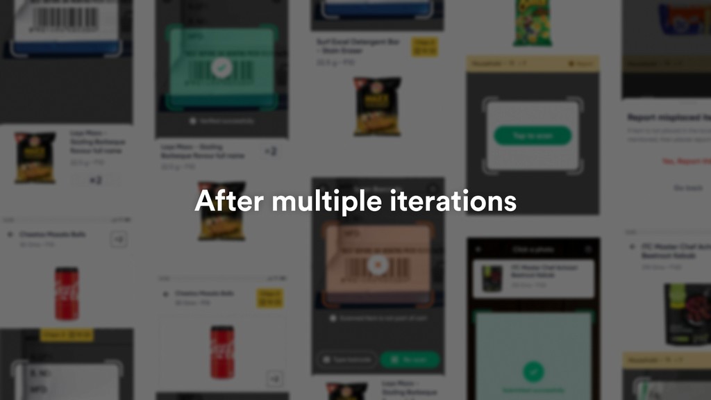
Guiding pickers
Final designs
Usability test enabled us to make the required changes such as removing the maps and other redundant information as well as the highlighting the important elements from our observations.

Usability test 2
Final results
01
Overall, the revised design with the shortest path sequencing made a tremendous impact, as it reduced the number of footsteps on an average by 35%. For one picker, it even reduced it by 40%.
02
Additionally, bigger image, quantity and location ID helped them easily find the correct variant of the item.

💡 Why and how did we measure footsteps?
Why?
We tested our designs using prototype, with no technical implementation because of limited tech bandwidth. And since the prototype had limitations, we wouldn't be able to measure exact time.
How?
We used the Google Fit app on a Pixel 2 phone to count the number of footsteps. That Pixel 2 used to be in their pocket while they were picking up the orders.
Guiding pickers
Possible solutions
🍱
Manual checking
A store member checks quality and quantity before packing the items in the bag
Pros
Quite reliable and works in almost all scenarios with a help of little training
Cons
Quite reliable and works in almost all scenarios with a help of little training
☑️ Finalised solution
🗺
Quality checking devices
We talked to few vendors to understand if these devices could actually work at scale or not
Pros
Solves all problems regarding fruits and vegetables
Cons
Too costly, not a scalable solution, demands proper training to understand a new technology
📱
Quality checking devices
Educate and nudge users to check quality/quantity at appropriate touch points
Pros
Relatively less time-consuming to build
Cons
Not the most reliable solution


Introducing QC Person
👉🏻 We took a relook at our current on-ground processes and made the following changes
👉🏻 We introduced a dedicated ‘quality check person’ whose sole responsibility is to check quality and quantity of the items just before packing the order
👉🏻 We also made sure that the auditing team will check the inventory regularly and remove the expired items and rotten vegetables and fruits
Updated workflow of order processing

Picker finds and scans all the ordered items from the racks
Quality Checker rechecks quality and quantity of the items
Packer packs all the items in a bag
Handover person handover the order to the delivery partner
Integrating into product
Updated in-store processes for QC person enabled us to make the same changes in the product. Taking a picture after checking the items made the QC person more accountable and helped us deliver the better quality items.

Prototype of final solution
QC person’s experience

Captured photos will work as a proof
👀 For issue control team
These photos will be available in the Merchant Dashboard as well so that IID team can do the root cause analysis when an issue is reported.
💰 For customer support
Same photos will be available in the Freshchat as well so that a Comm. Ops team can take better decision on refund while interacting with users.
Overall impact
35% less
footsteps of the pickers
In usability test, we observed 35% reductions of footsteps a picker takes while picking the items
15% less
time taken to pick the items
We were able to reduce the time by 40-60 seconds compared to the Control group.
60% less
issues related quality
IID percentage was reduced to 2-2.2% which was trending around 6-10% before.
What pickers said ❤️

Mahesh
"100% helping. For new joining, it is more helping. If item is not at location, I report it."

Chetan
"Sometimes we know where things are kept, but when we don’t know, we refer to the location. It decreases search time."

Venkatesh
"Yes, it is useful. It is easy to pick the order. It is helping to reduce time. It is not creating new confusion."
Learnings
Trust the design process
When we started the project, it felt like we’d get lost and wasn’t able to see clear clear direction. As always we stuck to the design process and moved forward. This was the first time we did two usability test for one particular feature in Merchant POD. As a result, PMs discovered a new way of getting the evidence instead of relying on just data. From the next project onwards, they started doing usability test even for smaller features to eliminate the small assumptions. I fell more in love with the process.
How to design for the next billion users and their specific context
The users we are building for in merchant POD, especially pickers, do have access to internet & mobile phones but they’re not that tech savvy. Also, the environment they work in, it’s so important communicate the information in the simplest form and removing other distractions. The designs must never waste their single second of time, instead it should speed up their process. Sometimes we have to trade off the fancy visuals with just text or simplified visuals but that’ works better in the given context.